Photo Composition: Leaving the Rule of Thirds Behind
September 15, 2023

The Rule of Thirds is a great tool, but there are many more ways to build a strong photo composition. Read this list of tips and tricks.
One of the first rules of composition a budding photographer will learn is the Rule of Thirds. There’s good reason for that. Quite simply, it’s one of the simplest and most effective ways to add impact to a photo. What’s more, it’s versatile enough to be useful in any genre. It’s also not the only method available to frame a photo.
In this article, we’ll explore some other, very effective visual composition guidelines that should be part of a photographer’s bag of tricks. The point isn’t to forget about using thirds. It simply shouldn’t be the only, or even always the first thing that comes to mind in creating an impactful image.
Simplification
How many images have you looked at – your own or others’ – that seemed “busy”? The usual effect is that you can’t find a single spot for your eyes to rest in the photo. You might find yourself wondering, “What was the point of this picture?”
One effective way to avoid this scenario is to simplify the composition. It’s so effective, in fact, that it’s probably one of the first things to consider when you frame a shot. How many “subjects” are there? Is the one you chose isolated well enough, or are there distractions in the frame?

Some of the most powerful photos are built on a very limited number of elements. Not only that, but starting with simplification helps bring other composition tricks into play. You’ll see how this works in the other techniques we’ll discuss. Meanwhile, try to start with a “less is more” approach to framing your photos.
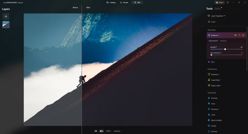
Before we move on, it’s worth mentioning that you can often save a “busy” photo by cropping it to eliminate distractions, or removing them with smart aids like the Eraser Tool in Luminar Neo. In other words, simplification should be a part of your post-processing routine, too.
The Rule of Odds
Here’s another photo composition tip that’s effective enough to be called a “rule”. It’s also one that would seem to break some of the rules, like balance. Regardless of that, the fact is that an odd number of elements tend to create more interest than an even number.

There are a number of hypothetical reasons this technique works. One of the most widely accepted and easiest to understand is that the lack of an element to “complete” a series leads viewers into the image in search of it. It’s also theorized that surrounding a single subject with an even number of elements makes the subject stand out. Working with odd numbers supports both simplification (one element) and triangular composition (three elements). Whatever the reason, framing your image based on odds can be very powerful.
The Photo Perspective Correction Tool You've Been Waiting For
Unleash!
Geometry
Don’t worry; you won’t need to study any math to use this composition tip. All you need to do is pay attention to geometric shapes in your images. They can be hidden within items in the frame or in the way elements are arranged. Interestingly, different shapes affect viewers in different ways.

Arcs: Curved lines, circles and ovals in a photo tend to create a placid effect without causing the image to become static. Your eyes follow these lines, but they’re led less abruptly, allowing your gaze to take in the surroundings. Circles also suggest completion, which has a calming effect.

Triangles: As mentioned above, triangular elements or arrangement of elements support the Rule of Odds. They also can help convey a sense of depth as well as balance.

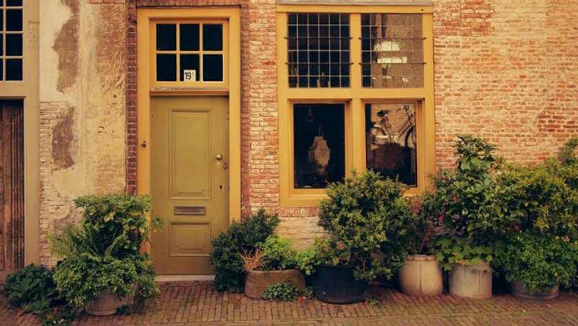
Rectangles: Block shapes can serve many purposes in a photographic composition. To begin with, you’re working within a rectangular frame. Similar shapes, such as doors or windows can be used to isolate subjects from or enclose them within an area. Vertical rectangles like columns convey a sense of height and strength. Horizontally, they help create a feeling of stability.
The Rule of Space
This element of composition is probably one of the most overlooked and underrated. Photographers often tend to concentrate on the elements of a photo that they ignore the space around the elements. That space can sometimes be used to great advantage and is the basis of several techniques.

Leading space, for instance, can help create a dynamic effect by allowing room for movement. This is accomplished by leaving space in the direction a subject object is moving or looking.
Contrast
Does it surprise you to find that listed here? We all know that contrast is an important aspect of photography, but is it really a compositional tool? Absolutely.

Contrast can be used very effectively to isolate a subject and lead viewers’ eyes where we want them to go. You can also limit contrast to create high-key or low-key images. As with space, the point is to think more actively about how you can use contrast when you’re framing your shot.
This is another element that can be manipulated in post-processing, such as in HDR imaging. Even so, it’s more effective if you have the increased dynamic range in mind when you plan the image.
Elevating Artistry with Luminar Neo

As we delve into the world of advanced photographic composition, the role of cutting-edge editing software becomes increasingly pivotal. Enter Luminar Neo – a game-changer in digital photography enhancement. This innovative tool offers a suite of AI-driven features, enabling photographers to effortlessly refine their images. With Luminar Neo, tasks like adjusting exposure, correcting colors, and even complex edits like sky replacements or object removal are streamlined.
Its user-friendly interface makes it accessible to photographers of all skill levels, while its powerful capabilities ensure that your creative vision is never compromised.
Advanced yet easy-to-use photo editor
Get Luminar Neo NowSo Much More…
We’re really just scratching the surface on composition techniques. We’ll cover more tips and tricks in upcoming articles. The real reason for this post, however, is to remind you that there’s much more to composing a photo than the Rule of Thirds. Start thinking out side that box and watch how your photography improves!


