How to Enhance a Photo
January 01
6 min. to read
Even pictures that look good on the camera's LCD can typically be enhanced with a little image adjustment. By following these simple steps using Luminar, you can take your photos from good to great.
The reason why I like Luminar for a job like this is because it has a variety of photo enhancer filters and online image enhancer tools, and it supports layers. So I can work on different areas of the photo to make them look just right.
Start by Looking at Your Photo
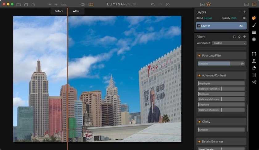
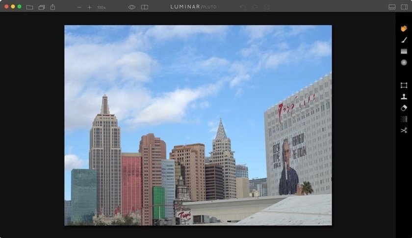
I know it sounds silly to encourage you to really look at your photo before you start image adjustments, but that's exactly what you need to do. This picture is a perfect example. Overall I like the lighting and the composition. But as I study the photo further, I've decided that I want enhance the sky in the image to have a little more pop, and I think the buildings should display more saturation and detail.
Choose the Basic Tools You'll Need
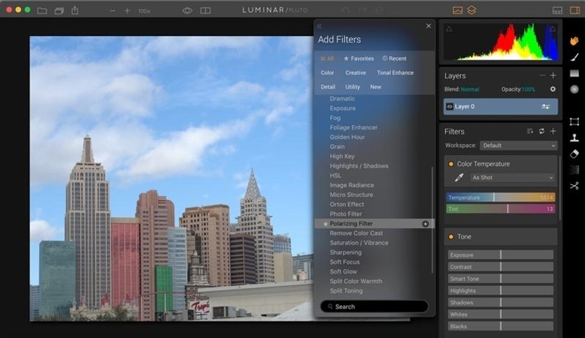
Since I know that I want more pop in the sky, I'm going to add the Polarizer to my workspace. I'm also going to add Advanced Contrast, Clarity, Details Enhancer, and Sharpening. These tools will help me enhance the look of the buildings in the photo.
Begin with What Needs the Most Work in the Photo
Photographers often don't know where to start image editing their photos. I recommend that you begin with what needs the most work. In the case of my Las Vegas skyline, I want to start with the sky. Depending on how that turns out, it will influence how much more image adjustment the buildings need.
As it turned out, adding a +72 amount for the polarizer is all the sky in the photo needed. I think it looks great. So now I can turn my attention to image editing the buildings in the photo.
Decide Global or Local
As I look at the buildings, it seems that I have two options. I could use the global tools that apply the changes to the entire photo, including the sky, or I could select just the buildings with the brush tool on a separate layer of the photo.
I started with global approach, but when I got the buildings the way that I wanted, the sky became too sharp and detailed, making it look unnatural. So I decided to add a second layer by clicking the + icon in the Layers panel to create a new working area just for the buildings. I gave each layer its own name by double-clicking on its label and typing the new description.
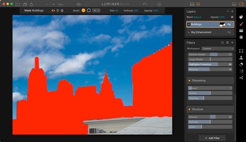
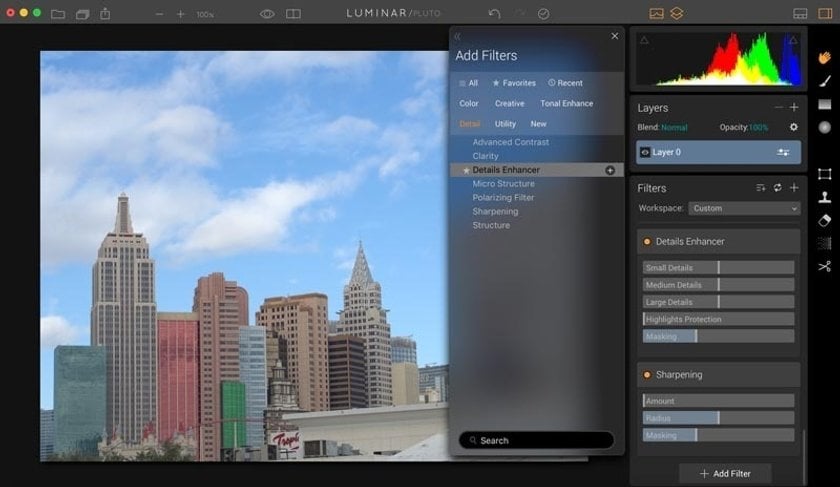 Once I finished painting the buildings with the brush tool, I then applied Advanced Contrast, Clarity, and Details Enhancer to this new image layer, knowing that it would only affect the buildings, leaving the sky alone.
Note: to check the accuracy of your brushing, click on the Show Mask Icon while the brush is selected, and all of your brush strokes will by displayed in red.
Checking Your Work
Check your work by clicking on the Quick Preview button, or using the Compare curtain that shows before and after. How does your photo look? If you've improved it, it's time to save the image by going to File > Save.
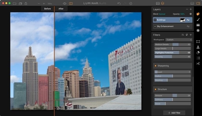 If you feel like you were a little heavy handed with your edits, the you can click on the History button and go back in time to where you were happy with the editing, then restart from that point.
The Final Review
Once you think you've finished, it's time for one more good look at your image. Press the F button to go to Full Screen Mode. Take a few moments to study the image. Did you accomplish what you set out to do? If so, save one more time, just to be sure.
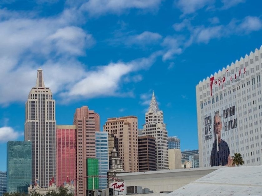 Now you can export the image to an appropriate size for sharing with friends and on social network.


