How to Make a Flyer in Photoshop: Step-by-Step Guide
April 19
14 min. to read
 In this tutorial, you will learn how to make a flyer in Photoshop in printed form. We'll show you step-by-step how to set up coloring and layers, work with text tools, and others. Decide on a topic: would you like to create a business flyer, a promotional flyer, or a standard flyer? Before the beginning, we recommend assembling a pool of images to use to create a flyer.
Making a Flyer in Photoshop: 4 Easy Steps
Step №1. Creating a template
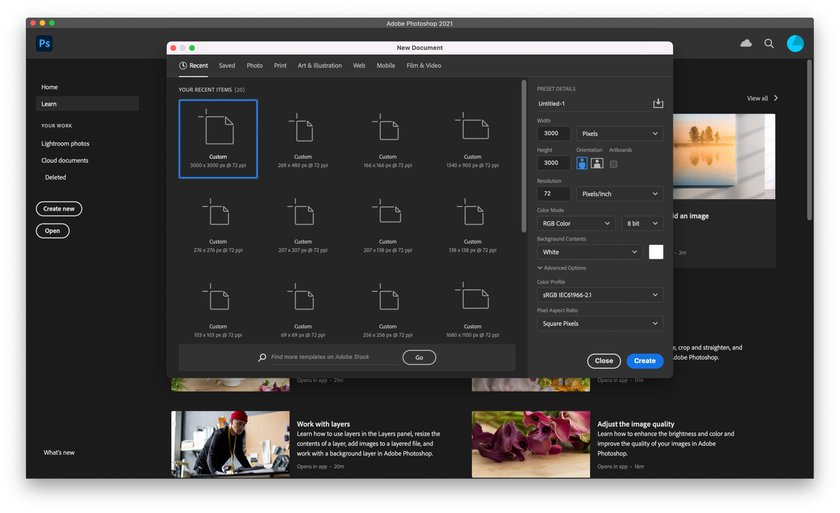
Now that you're ready to make a flyer in Photoshop. First, create a new document of 1200 by 1800 pixels.
 Since the file is intended for printing, we set it to 300 dpi and CMYK color mode. Now you need to configure the workspace. Activate the ruler with the key combination Ctrl+R. Pull out the ruler and place it in the center of the document. Pull out the guideline (with the move tool and the shift key you can move the guideline) and place it in the center of the document. Then set two more guidelines (to see the edges of the indentation) at 400 and 800 pixels. To display the values in pixels, select “Pixels” in the top panel of the ruler. In the middle of the document, we put a horizontal guide and with it three additional 500, 800, and 1600 pixels.

Step №2. Creating a background
 Now we are ready for the next part of the called How to make a flyer with Photoshop. Follow the instruction:
- Press Shift-Cmd-N to create a new layer.
- Now you need to fill the background with white with the ALT+Backspace key combination. Make sure that the settings are CMYK Sliders, as you are creating a document for printing.
- Create a new adjustment layer Gradient Overlay. In the Layer Style Panel, select Gradient.
- Set the white color Location to 30%.
- Change the black color value to Pale Yellow (C=9 M=6 Y=14 K=0).
- Use the rectangle tool to create a rectangle. Its size is 216 mm by 56 mm.
- Align the rectangle to the top left edge of the document. Fill with Dark Brown (C=49 M=74 Y=80 K=70).
- Use the Pen Tool to add a point on the bottom edge of the rectangle.
- Using the Direct Selection Tool, set the anchor points of the line so that you get a Bézier curve.
Make sure you leave enough space to indent the document.
Step №3. Creating new layers
To continue making flyers in Photoshop, go to File > Place Embedded and select the picture you want to set as the background.
 Use the Move Tool to move the photo to the document. Make another rectangle with the Rectangle Tool. Set flyer size to 216 mm by 100 mm. Use the Direct Selection Tool to position the rectangle exactly above the photo in the upper left corner. In the upper Rectangle Tool Panel, click Mask. This will add a vector mask to the photo layer. Take the Pen Tool and place an anchor point on the mask. Make a curve with the Direct Selection Tool. With the already familiar Pen Tool and Direct Selection Tool, try to shape the mask. Go to Filter > Blur > Gaussian Blur. Set the Radius to 6. Select Smart Filters. Use the Gradient Tool to guide the lightning toward the right edge.
Create a Brightness/Contrast adjustment layer.
Right-click on the adjustment layer and choose Create Clipping Mask. Thanks to the clipping mask, the adjustment layer will only affect the photo.
Create a Solid Color fill layer: C=30 M=80 Y=100 K=30.
Hold Alt and drag the vector mask of the photo to a new adjustment layer. Use the Direct Selection Tool (A) to move the upper-right anchor point to the upper-right corner.
On the mask of the fill layer, use a soft brush with 75% opacity to return part of the photo. Draw another rectangle: Fill it with light brown (C=10 M=65 Y=100 K=0). Drop this rectangle under the dark brown one. Use the Pen Tool and Direct Selection Tool to reshape the light rectangle.
Step №4. The text logo
 Now you can continue designing a flyer in Photoshop, Use the Ellipse Tool to create a circle with a diameter of 248 pixels in brown (C=30 M=80 Y=100 K=30). Apply the Drop Shadow style.
Create a circle of 400 pixels in diameter, dark brown (C=100 M=80 Y=45 K=50). Apply the same Drop Shadow style to the second circle as to the first one. This can be done quickly with the layer context menu: Copy Layer Style/ Paste Layer Style.
Drop the dark-blue circle below the light brown one. Select the Horizontal Type Tool, “Proxima Nova” font, and sign the circle. Open the Character window (Window/ Character) and adjust the font. Now you can add text. Add text with the Type Tool.
This tutorial uses fonts from the Proxima Nova family. The Top Title Size is 17 pt. Add lines of text, each on a separate layer. Move them with the Move Tool to the desired locations.
Of course, using different templates which can greatly simplify your work is perfectly acceptable. Not sure if you want to use a particular template? Go and edit it!
Or you can resolve this problem in another way:
- Draw an Ellipse shape (U) with dimensions 248 px by 248 px.
- Fill with Brown Color (C=30 M=80 Y=100 K=30).
- Add Drop Shadow effect (opacity 14%, distance 5 px and size 15 px).
- Add the shadow effect to a layer using the fx button in the Layers panel. Change the shadow effect settings using the sliders.
- Let's make another Ellipse (U) with a size of 400 px by 400 px.
- Fill in the Dark Blue Color (C=100 M=80 Y=45 K=50).
- Apply the same Drop Shadow effect to it. You can adjust the shadow again manually or by right-clicking, selecting from the list Copy Layer Style, and copying the finished effect to a new layer. Place the blue circle under the brown one.
- Add text with the Type Tool. In this tutorial, the fonts of the Proxima Nova family are used. The Top Title Size is 17 pt.
- Add lines of text, each on a separate layer.
- Move them with the Move Tool to the desired locations.
- Repeat the same for the new text. The size of the first line is 31 pt.
- Create a new title with Type Tool. Use Proxima Nova Light font and size 18 pt.
- With the same Type Tool, add a subheading. Its size is 36 pt.
- Adjust the Character Tracking to -10.
- Select both layers with the text.
- Hold down the Alt key and drag the lines down.
- Once again, use the Type Tool to rewrite the text. Position it with the Move Tool.
- Go to File > Place Embedded and move the vector image with the logo.
- Scale the logo and place it in the upper right corner and assign to it the Drop Shadow effect.
- In the Layer Style Panel, set Opacity to 11%, distance to 3 px, and size to 16 px.
So you can add on a sheet any text, company logo, etc.
What size should a flyer be?
Many newcomers to photo editors make this mistake in the process of creating a flyer in Photoshop. If you make a document the right size at once, you will save time without getting an unpleasant surprise at the time of printing. If you want to print a flyer on A5 paper, the size of the document must be 216×154 mm.

Ideas for Simple and Elegant Flyer
Handbill
Now that you know, how to create a flyer on Photoshop let's talk about ideas for them.
First, you need to be fairly clear about what the flyer should be. The color of the flyer is the first thing a person reacts to. Therefore, it is very important to choose the right color scheme for the design.
Harmonious color schemes are made up of three colors that are evenly distributed throughout the color wheel to form an equilateral triangle. Pick the right color palette, and you're halfway to a successful design! Overly bright spots of color can be annoying, especially when they occupy a large space.
The rich design of the flyer can be created not only from bright colors. Black and white will advantageously emphasize color accents and make the composition harmonious. The complementary colors in the color wheel are opposite to each other. Typical examples of complementary color combinations are green and red, blue and orange, purple and yellow.
 If you're using colors in your flyer design that may seem overly intense, try softening the composition with a subtle pattern or individual elements of calm basic hues.
In other words, if you can't visualize clearly, you can quickly sketch by hand on paper and then switch to a software environment on your computer. You can also use the leaflet templates offered in Photoshop.
Digital Flyer
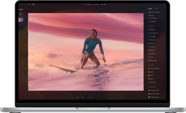
If you want to create a flyer in Photoshop, you can take advantage of the extensive set of tools provided by the program. Also, you can try Luminar Neo which is one of the most effective apps for editing photos and creating collages.
 Filters are a good way to present your photo in a better or alternative way. Experiment: apply one or 2 or 3 filters to a photo and choose the desired filter intensity (for example, not 100%, but 20-30%). Do not limit yourself to strict color combinations, experiment with gradients. If you find working with gradients difficult at first, try making a collage out of photos, moving from softer to more intense shades.
Creating flyers for a concert, a dance party, or the opening of a large-scale exhibition? Try using a colorful illustration as the main theme! You can explain to the audience what will happen at the event in more than just text on a flyer. You can supplement the short text talking points with pictograms and individual illustrations. When designing a flyer using icons, make sure that all the images are rendered in the same style. So you will create a cohesive and harmonious composition, which will not visually "disintegrate”.


